Showing posts with label PV. Show all posts

Friday, June 8, 2018

Exponential Growth Towards a Sustainable Future: the Limits of Solar Panel and Wind Turbine Production

Solarplant near Rüdersdorf, Germany 2014, © Molgreen, CC BY-SA 4.0
Solar plant near Rüdersdorf, Germany 2014, © Molgreen, CC BY-SA 4.0

(Reblogged from blog.wozukunft.de)

Guest post by Gregor Hagedorn

Many people, including myself, fear that the great acceleration (1, 2) of our consumption and destruction of resources such as land, biodiversity, soil, minerals, and fossil energy sources, could lead us into a catastrophe. Other people point out the positive side of near-exponential growth in various fields: renewable energy production, "biotechnology and bioinformatics; computational systems; networks and sensors; artificial intelligence; robotics; digital manufacturing; medicine; and nanomaterials and nanotechnology" (Peter H. Diamandis & Steven Kotler 2012. Abundance: The Future Is Better Than You Think). Others propose that the roadmap to prevent the climate catastrophe should follow an exponential "carbon law", modeled on Moore's law for the semiconductor industry (Rockström et al 2017).

Exponential growth models leading towards sustainability certainly offer hope. An example might be the renewable energy transition: the growth of cumulative solar energy capacity is indeed almost exponential.

Exponential Growth in Renewable Energy Production (© Gregor Hagedorn, CC BY-SA 4.0)
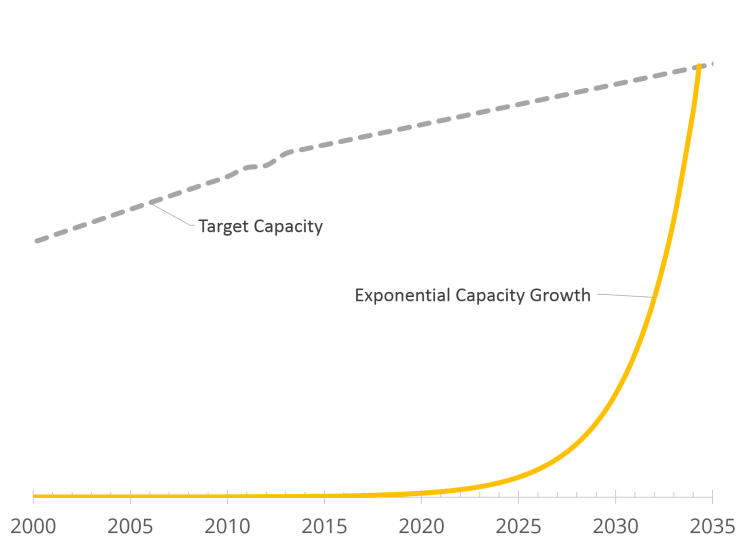
Exponential Growth in Renewable Energy Production Capacity. The gray target final energy capacity is assumed to be slowly increasing as a result of a combination of energy savings in rich countries and equitable growth in poor countries. (© Gregor Hagedorn, CC BY-SA 4.0)

However, looking at the graph, it is clear that the assumption of unchecked exponential growth makes no sense. An extrapolation of the historical annual growth rate (39.14%) means that the final doubling of capacity occurs in the last 25.2 months. Huge productions facilities would have to be built for the necessary solar panel and wind turbines – to be used only for a very short time.

Most scientist and economists are aware of this, but I have experienced many lay people and politicians taking “exponential problem solving” at face value – which may be a problem.

Renewable energy capacity growth as an example

What would a more realistic model be? As a biologist, I am acquainted with logistic growth models limited by a capacity factor such as the available food or land. But organisms will reproduce until the capacity is exhausted, often going into overshoot followed by a period of population collapse (die-off). Humans have foresight (at least sometimes). And investors usually calculate the profitability of investments.

Bardi & Sgouridis 2017 evaluate the effect of time of return on energy investment of renewable energy production installations (e.g. photovoltaic installations, wind parks). In my understanding, this is relevant but different from the effect of the economic return on investment on the factories producing the solar panels, wind turbines, etc. What effect does a minimum life-span of these factories have on the energy transition? As I could not find a publication (please comment, if you know one!), I decided to investigate this.

As I could not find a publication (please comment, if you know one!), I decided to investigate it myself. I will focus on a single of these transformation dynamics, the economics of investing. This is not meant to be a comprehensive model, encompassing the complexities of the real world and aimed at making actual predictions. I think of it more as a thought experiment to estimate the difference between exponential growth and a reasonable return-on-investment on production facilities under otherwise ideal growth conditions. Basically, I assume that any new factory should be running, with reinvestments and upgrades, for 30 years. The following indented text documents the assumptions behind the model (skip ahead, if you like).

1. To simplify, I use the capacity growth value for solar photovoltaic panels (0.105 GW 1992 to 405 GW projection 2017, = 39.14% annual or 2.78% monthly growth) as representative for the entire renewable energy mix needed in the future (the combined growth rate of wind turbines, concentrated solar, geothermal, etc. would lead to a more complex and more realistic picture).
2. Global Final energy consumption values are from Wikipedia (partly interpolated and partly estimated from primary energy supply).

3. After 2014, consumption is extrapolated using assumptions about energy savings and equitable growth needed for poorer countries. I assume that the combination of energy savings and additional energy needed for equitable growth for a good life on 9-12 billion humans will be doubling global final energy consumption between 2014 and 2100 to about 220 PWh/year. The slope of this increase is significantly smaller than the past increase, but the sudden transition into linear growth is a strong simplification. The end result roughly matches the common assumption of a demand of 2kW average equivalent power/person in 2100 (see., e.g., Bardi & Sgouridis 2017); 12 billion people * 2 kW = 24 TW average = ca. 210 PWh/year.

4. Global final renewable energy capacity is calculated by assuming we need 8 × average output as peak output; compensating for within-day volatility, seasonal volatility requiring long-term storage, average capacity factor (cloudy/non-windy days), regional volatility (if Portugal and Germany are to supply each other to reduce volatility, they both need large excess capacity). This is a wild guess. The capacity factor for solar in Germany is around 10%, wind between 20 and 50%, but we talk global here and I have not good data for a global average. Please help if you can provide better global, cross-technology estimates for the relation between peak capacity and annual final renewable energy consumption!

5. The model assumes that factories producing solar panels, concentrated solar plants, wind turbines, etc., require a production time of 30 years for an economic return on investment.

6. During this time, re-investments occur making production cheaper or increasing the production capacity (higher wind turbine/solar panel output, or more efficient technologies, generating more power per item). Since both solar panels and wind turbines are relatively mature technologies, I assume an increase in capacity for a given factory of 30% over the 30-year lifetime (modeled as 1.32% per year in the first 20 years, with no further investments and gains in the final years). Again, this is a wild guess; better estimates are most welcome. (Different assumption for improvement rates change the outcome only marginally since it is mostly equivalent to the addition of small factories with a shorter lifespan, decreasing the average lifespan of a factory per production capacity.)

7. The model includes a replacement rate for older renewable energy installations. The aging-related yearly capacity loss of various renewable energy solutions (e.g. 0.5-1% in solar panels) is ignored here, considering the assumptions for overcapacity above. For solar the panel warranty is usually 20-25 years, but usability may be much longer. I assume 20% replacement for yearly cohorts after each of 20, 25, 30, 40, and 50 years (i.e. max lifespan 50 years). The 20-year category includes replacements for storm damages, etc.

8. After 2051, the production time of some factories is extended for a number of years, to reduce the ensuing production fluctuations. Again: The real world is much more complex. Investment into production plants depends on many economic factors: workers, capital, interest rates, location and regional planning, regulatory conditions, supply chains for raw material and preprocessed parts, etc. And, again, this is no prediction model, but a mind-sized analysis of one factor!

The resulting graph looks like:

Factory Depreciation limited versus Exponential Growth in Renewable Energy Production (© Gregor Hagedorn, CC BY-SA 4.0)
Factory-depreciation-limited (blue) versus exponential growth (yellow) in renewable energy production (© Gregor Hagedorn, CC BY-SA 4.0)


What did I learn?

"Exponential growth" only matters in the beginning. The vast majority of capacity increase happens between 2027 and 2051 in a near-linear fashion. Under the parameters chosen, only 7.8% of the capacity is produced under the exponential growth model. Clearly, this result depends on the growth rate and the expected lifespan of production facilities for solar panels, concentrated solar power, wind turbines, etc. The result will be similar whenever the factory lifespan is similar to the time it takes to reach the capacity growth target.

Some additional, minor observations (skip ahead, if you like):

1. Whereas under a fully exponential calculation the energy production capacity for 100% Renewable Energy is reached 2034, it takes until 2051 in the present calculation. (Note that this may still allow reaching the Paris climate goals; but also note that the calculation does not deal with issues like volatility, storage, transport, stranded assets, etc.).

2. With regard to new production capacity (factories) in the present calculation: 2027 is "peak acceleration", followed by five years in which production capacity continues to increase, but with less new capacity each year. And that is it. Under the (arbitrary!) assumption that you need at least 30 years return on investment into a new plant, it would be uneconomical to build additional production facilities between 2033 and 2051. From 20151 on, replacement of older factories and increasing demand for solar panel and wind turbine replacement creates a new market for the establishment of new production facilities.

3. Between 2051 and 2100, a period of alternating over- and underproduction occurs in the present calculation, which uses global yearly factory cohorts and an inflexible re-investment / capacity upgrade scheme. In reality, many individual factories would have different lifetimes, be upgraded at different times, and some factories might make losses and be closed prematurely. All of this would enable the markets to track demand more flexible. Still, being able to track a market which transitions from a strong growth market to a weak growth market which then transitions into an increasingly strong replacement market will be a challenge. Some Lotka–Volterra-like oscillations are in fact not uncommon in markets, see, e.g., the DRAM production in the semiconductor industry.

4. The production capacity for solar panels, wind turbines, etc. in 2017 is about 114 GWpeak/year (please comment if you think this number is incorrect!). Under my assumptions (and in order to achieve the target capacity by 2051), production capacity must very quickly rise to about 5700 GWpeak/year in 2032. It then grows slowly, through productivity increases in existing factories to a peak of 6643 GWpeak/year in 2047. The exact values and years depend on many assumptions in this calculation and are likely to be only very rough estimates. However, the estimates show that building sufficient production capacity for the energy transition is a huge challenge – and a huge market opportunity.

5. Comparing the results with the return-on-energy models from Sgouridis et al. 2016 (see the crude graph below): a) total peak capacity in 2075 is about 100 TWpeak, less than then 165 TWpeak in our calculation; b) total capacity is falling after 2050 in Sgouridis et al. 2016; c) the main growth occurs about 8 years earlier; d) the transition towards capacity is smoother, i.e. in the last 8 years capacity is added slower than in my (purely factory-output-optimized) model.
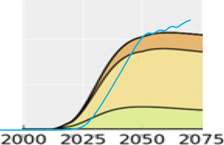
Comparison of model with result of Sgouridis et al. 2016 (© Gregor Hagedorn, CC BY-SA 4.0)


General Conclusions

The idea that a future acceleration of technological progress at an exponential rate will solve many problems has several proponents, the best known of which are perhaps Diamandis & Kotler. Their 2012 book has been widely reviewed and criticized. Patrick Tucker (2012, An Awesome Adventure to the Future) applauds them for encouraging the view that problems can be solved. But as Dale Carrico (2012, Schlock and Awesome; Or, The Futurists Are Worse Than You Think) points out, uncritical wishful thinking without regard to problems and limitations is "escapism from the real present, what it offers as solutions are nothing but distractions from problems". Gregor Macdonald (2012. 'Cornucopians in Space' Deliver a Dangerously Misguided Message – Optimism has its dangers) notes that Diamandis "is an adherent to the notion that exponential growth in technology will eventually reach a crescendo, thus offering humankind super-solutions at a kind of hyperspeed rate of change." But while technological progress is helpful and welcome, "the magnitude of the world’s present challenges cannot wait for the array of potential solutions that may start to work". He warns that "celebrating the success of solutions before they have actually arrived – indeed, well before they have arrived, is no solution at all". Michael Marien (2012, globalforesightsbooks Book of the Month) observes that the "techno-ecstatic focus of Singularity … serves to obscure the need for “soft” social technology that is of equal if not greater importance" and "questions are ignored about how the new abundance will be distributed in a world of massive and increasing inequality, where many governments are running huge deficits and hamstrung by ideological gridlock and obsolete ideas", conceding that "As inspirational futurism suggesting possibilities of a better world for all, there are certainly many good budding ideas here that may bloom."

Some of the general problems of belief in unchecked growth are very nicely exposed by Tom Murphy (2012, Exponential Economist Meets Finite Physicist) - highly recommended!

One of my own conclusions is, that exponential decay, such as the aforementioned "carbon law", makes more sense than the growth case. Overall, however, the assumption that initial large reductions can be achieved with relatively low investment, followed by decreasing reductions at increasing cost is more plausible than the case of exponential growth. Again, this cannot be repeated forever, as cost becomes prohibitive, but this is not really necessary to achieve the goals intended by the "carbon law" proposal.

My own view is that it is good to point out signs of hope and progress (some of my favorites are, e.g., Hans, Ola & Anna Rosling - do read the new book 'Factfulness', Max Roser and his co-workers, or Dina D. Pomeranz). And we all hope that innovation can solve at least some of our problems.

However, most people already expect miracles from technology. While innovation may follow exponential growth for some time, this will in all likelihood always change to a different growth model over time1. The calculations above are only an example.

Scientific limits of the earth system, economic limits (as in the example above), sociological and psychological limits of humans and their societies, as well as the potential for exponential technological growth, need to be viewed together. Ignoring parts of the system will not lead to a solution.

But worse: I see the perceived need for and the creed in endless future technological innovation as a distraction. As misleading. as prolonging our current phase of procrastination and not solving the many problems we can already solve right now.

It is not true that we are currently desperately trying to survive and have no other option than to send our own children into a slavery of food, energy and resource scarcity. It is not true that our only chance is to hope for yet non-existent technologies.

The truth is: We have the technologies, we can solve the energy (see, e.g., Bardi & Sgouridis 2017), food, biodiversity, transportation, equity, etc. problems.

But we are not using the solutions at the necessary scale. We are procrastinating and seeking excuses: whether it is that the problem cannot be solved or that they will solve themselves thanks to a sudden explosion of exponentially growing innovation. We are celebrating ourselves in the media for deploying positive solutions at small scales. At the same time, we are directing the general economy through taxes, tariffs, and subsidies at many orders of magnitude into the opposite, destructive direction.

We are not building a house for our children, we are burning it down. Our greed for money, for personal power and sex, for eating meat and other luxury foods, for playing with ivory tower problems has us care more about ourselves than about the future of our children.


Notes
1 I believe this even applies to the tech development under the scenario of technological singularity, wiping out humanity – but this is a different discussion...


References

Ugo Bardi & Sgouris Sgouridis 2017. In Support of a Physics-Based Energy Transition Planning: Sowing Our Future Energy Needs. BioPhysical Economics and Resource Quality, December 2017, 2:14, doi:10.1007/s41247-017-0031-2

Rockström, Gaffney, Rogelj, Meinshausen, Nakicenovic, Schellnhuber 2017. A roadmap for rapid decarbonization. Science 355: 1269-1271. doi:10.1126/science.aah3443

Sgouris Sgouridis, Denes Csala & Ugo Bardi 2016.The sower's way: quantifying the narrowing net-energy pathways to a global energy transition. Environmental Research Letters, Volume 11, Number 9. http://iopscience.iop.org/article/10.1088/1748-9326/11/9/094009/meta


(© Gregor Hagedorn 2018, CC BY-SA 4.0, first publ. 2018-05-15, last updated 2018-06-11. Image: a cropped version of Photovoltaic installation near Rüdersdorf, Germany, © Molgreen, CC BY-SA 4.0)

Thursday, October 27, 2016

Another failure of scientific peer-review: a wrong paper on the energy return of photovoltaic energy


Theoretically, whatever is published in a scientific journal should go through a rigorous review process that ensures that it is correct and reliable. Unfortunately, it doesn't work that way.

If you follow the debate on renewable energy, you know how important is the question of the energy return (or EROEI) of the various sources. An EROEI lower than one would make the source - PV, wind, or whatever, an energy sink, not a source. And this is exactly what Ferruccio Ferroni and Richard Hopkirk have been claimed with a paper recently published in "Energy Policy" that arrives to results that are completely different than to those of all the other studies on the subject.

The paper by Ferroni and Hopkirk is simply wrong. You can read below a complete demolition of their arguments performed by Maury Markowitz. But, no matter how wrong is the paper - and it is wrong - this story raises some disturbing points about how scientific information is validated and diffused.


1. Any paper, no matter how bad, poorly conceived, and ultimately totally wrong, can be published in a scientific journal if the authors are persistent enough and try many times. Eventually, they will find a combination of editors and reviewers sufficiently incompetent, sloppy, or biased that they will accept it.

2. There is no way to correct the mistakes of a wrong paper once it is published. The journal will retract it only if it is possible to prove that the authors are guilty of evident fraud or plagiarism. But "simple" mistakes, things such as wrong citations, misinterpreted data, inappropriate data treatment and the like are rarely sufficient to force retraction.

3. The only way to protest against a wrong paper is to ask to the journal to publish a rebuttal. They will do that with the same degree of willingness that you feel about having a tooth pulled, but they will do that, asking also to the authors of the original paper to write a counter-rebuttal. The whole task is long, painful, and ultimately useless as it may end up giving more visibility to the initial paper.

4. Mark Twain is reported to have said that "A Lie Can Travel Halfway Around the World While the Truth Is Putting On Its Shoes". That's exactly what happens when a wrong paper sees the light in a scientific journal. It will spread fast with the people who are seeking for whatever can help them with their confirmation bias. And the rebuttals will be considered as proof of the conspiracy by the PTBs to suppress the Truth.


That's exactly what's happening with the F&H paper, gleefully paraded around as proof that photovoltaic energy is a scam and a waste of money. A rebuttal to the paper is in preparation by a group of scientists, but it will arrive late and will do little to correct the wrong information already diffused on the Web. The problem is that this information affects choices that will determine our future: we can't afford to base them on wrong studies that somehow managed to get published.

So, how did we find ourselves into this mess? Who created a scientific review system that has no quality standards, no independent quality control, no audits, no nothing? I have no idea, but it is clear that the system badly needs a serious reform.


Here is the demolition of the Ferroni and Hopkirk paper, reproduced from Markowits's blog

__________________________________________________________________

From Energy Matters by Maury Markowitz

Another PV ERoEI debacle May 17, 2016

Posted by Maury Markowitz in balonium, solar.
Tags: , trackback

tommy

Your face should have this expression when you read Ferroni and Hopkirk’s paper.

recent report by Ferroni and Hopkirk explores the energy balance of solar power, and concludes that using PV is energy negative. That is, building PV requires more energy than the panel will produce over its lifetime.
 
Claims like these pop up from time to time, and normally end up being based on definitional tricks on the part of the authors. This example is no different in that respect, but in this case they also add a liberal dose of bad data.
 
The paper is so filled with errors and omissions that’s it’s almost breathtaking. Once again, dear reader, it’s time for the deep dive.


The sincerest flattery

While googling myself (I can’t remember my URL any more than you can) I found to my delight that the name of this blog has been taken up by a pair of bloggers from Aberdeen. How I never came across this previously is something of a mystery; I guess the web is deeper than one would imagine.
 
In any event, a May 9 post by one of the authors pointed me to the paper that is the topic of the rest of this article. After stating that the topic of ERoEI is new to the blog, he goes on to note that when he came across this paper, “the findings are so stunning that I felt compelled to write this post immediately.”
 
When I come across a study in the renewables field with findings that are “stunning”, I normally hold it at arm’s length until I can run the numbers myself. That’s because the field is utterly filled with bogus information from thinly disguised coal company shills to the nuclear true believers

Don’t get me wrong, there’s just as much BS going the other way, from the usual suspects to the space heads, which is all the more reason to be super-skeptical. While Mr. Mearns does make some comments about the validity of certain inputs in theoretical terms, in the end, he quotes the bottom line:

Solar panels will produce only 0.83 times the amount of energy they take to produce… If correct, that means more energy is used to make the PV panels than will ever be recovered from them during their 25 year lifetime.
That’s a big “if correct.”
 
And guess what, it’s not correct.

Start bad…

So let’s get into the meat of it. The paper starts with the authors having examined 28 other papers on the topic and found they had a wide variability of Cumulative Energy Demand (CED), the amount of energy used by a product over its lifetime. They conclude that “the authors … were not following the same criteria in determining the boundaries of the PV system.”

Now getting the CED is important, because the overall energy balance, ERoEI,i s basically energy out divided by energy in. So you’re going to need to have a good value for that CED, and there’re all over the map. So their solution is to define an entirely new version – yay!
 
But now they change gears, and work on the other side of the equation, the total energy produced. 

And they attempt to do this in per-square-meter terms.
 
Now stop right there.
 
The industry, and I mean the entire power industry here, not just the renewables industry, measures everything in either per-watt or per-kilowatt-hour terms. That’s because the physical mechanisms of the generators differ wildly, but a watt is a watt, so when you convert to those terms you have a real apples-to-apples comparison.
 
Consider an example; if I tell you a hydro dam cost $2/Watt and a new wind turbine costs $1.50/W,well, there you have it. Now what if I told you that the dam cost $2 per square meter and the turbine $10? Well, does that area include the reservoir? Does the turbine include all the area around it, or just the actual footprint on the ground? See the problem? Area is tough to pin down. Dollars are not.

So why would the authors pick such an odd unit? I can’t say for sure, but in the abstract they mention something about how “solar radiation exhibits a rather low power density”. Well, sure, and that’s important why? Apparently it’s not, because it only figures in very peripherally in the calculations, and has no effect on the bottom line.
Whatever, let’s get to the numbers at hand:

The data are available in the Swiss annual energy statistics … and show an average value of 400 kW ht/m2 yr (suffix “t” means “thermal”) for the last 10 years. This is an indication of the rather low effective level of the insolation in Switzerland. … The uptake from the incoming solar radiation is converted into electrical energy by the photovoltaic effect. The conversion process is subject to the Shockley-Queisser Limit, which indicates for the silicon technology a maximum theoretical energy conversion ef- ficiency of 31%. Since the maximum measured efficiency under standard test conditions (vertical irradiation and temperature below 25 °C) is lower, at approximately 20%, the yearly energy return derived by this first method in the form of electricity gen- erated, amounts to only 80 kW he/m2 yr.
Ok, if you don’t really know much about solar power, you might not immediately see the problem with this statement. What they’re doing is a double conversion – they’re not calculating the amount of energy produced by a PV panel, they’re taking the amount of heat collected by a thermal panel, then applying a formula to convert that to expected electrical power production.

I-See-What-You-Did-There-Fry1 

But that conversion is totally wrong. The Shockley-Queisser Limit doesn’t work on thermal energy, it works on the original solar energy. And no, the thermal energy is not a good proxy for the original solar energy. The main contribution to the losses in PV, the SQ limit, is wavelength, which doesn’t come into play in thermal collectors at all. And the main contributor to losses in thermal collectors is ambient temperature, which has a minor effect on PV.
 
The two are just not the same, you can’t do that.
 
But more to the point, why would they do that? Because the same source they quote for the thermal value publishes actual electrical output figures as well, which they then go on to quote:

According to the official Swiss energy statistics (Swiss Federal Office of Energy, 2015), an average for the last 10 years of 106 kWhe/m2 yr is obtained for relatively new modules.
This number is 30% higher than their calculation based on thermal, a discrepancy they don’t even try to explain.
 
Beyond that, any number that is “an average for the last 10 years” is, by definition, not talking about “relatively new modules”. Ten years ago the average panel was about 160 Watts and cost about $5.00/Wp. Today they’re around 280 Watts and cost about $0.45/Wp. The vast majority of the world’s PV was installed in the last three years, so any calculation based on data older than that is just plain wrong.

SolarGIS-Solar-map-Europe-en 

And even this number, 106, is significantly lower than 

I would expect given that Switzerland has fairly average insolation for mid-latitude Europe. So what’s up with that?
 
Well when I checked the cited source I found that no such number is actually reported. One can only find total output numbers and then work back from there, but the authors fail to give their calculation. And those totals  -wait for it- go back over a decade, so we’re right back to that problem again.
 
Which is all the more funny when you consider that such data is trivially available on the ‘net. Anyone who wants do to do this calculation should do what we all do; use NREL’s PVWatts. It has highly accurate weather data going back 30 years taken only from first-class sensors.
 
I typed in Zurich for the location, and selected the TMY3 data set. For the system size, I considered a typical modern 280 Watt panel at 1.6 m², or 175 W/m², and typed 0.175 into the System Size. I also changed the tilt from 20, which is good for California, to 30, which is good for Zurich. And here it is:

Screen Shot 2016-05-16 at 10.05.02 AM.png
 
They said 106. We’re at the very first number in the paper, and they’re already off by a factor of 60% from what the industry standard tool suggests.No attempt is made to explain this, except for dismissive comments about industry calculators.

 …get worse…

Now the authors turn their attention to expected lifetime of the panels, which is needed in order to calculate the overall lifetime energy production. They do so in a rather convoluted fashion, starting by considering the amount of panels recycled in Germany:

This was 7637 t. A module of 1 m2 weighs 16 kg and 1 kWp peak rating needs 9 m2 and consequently, scaling this up, a 1 MWp module will weigh approximately 144 t.
Hmmm. A SolarWorld 280, a typical modern panel, masses 17.9 kg. That’s 17.9/1.6 = 11.2 kg/m². I really have no idea where they got their value, and they don’t include any sort of reference. A 1 MWp system using these panels would require 1 million / 280 ~= 3570 panels, or 3570 x 17.9 = 63,903 kg = 64 t. So now we’re at calculation number two, and we find they’re off by another factor of two.
 
The paper goes on to use these numbers to suggest a real lifetime is about 17 years. Now the problem is that if older panels are heavier, then the number on a per-kg basis is automatically skewed towards older panels again. Or to put it another way, if you had 10 panels from each year since 1990 and scrapped one from each year, when measured by weight it would seem that more older panels are dying.
 
And once again I’m left scratching my head why they would use this convoluted magic, when one can find real values in seconds. In fact, one of the most quoted examples is right up the road from them on the LEEE-TISO buildings. The vast majority of these panels, apparently the first grid-tie system in the world, are still running fine after almost 35 years now. They calculate the losses at 0.2 to 0.5% a year, which corresponds to a panel lifetime on the order of 60 years.

…a little more…

They then ignore their previous calculations, and use a 25 year lifetime. So apparently all of that was for nothing! And that brings us to this:

Experience has shown that, on average, efficiency and hence performance de- gradations of around 1% per year of operation must be expected (Jordan and Kurtz, 2012).
Now we go from bad to terrible. They claim this 1% number comes from a paper by Jordan and Kurtz. Well that paper is available online, and actually states the measured rate varies widely, from 0.23% to as much as 2%. And the mode among that data is between 0.4 and 0.5%, which you can see on page 4 of the paper.
 
So if the paper they quote says it is 0.5%, how do they get 1% from the same report? Because they chose the figure on the right of page 4, which includes low-quality data. And what is the difference between the two? Well, the low-quality data is:

very sensitive to several sources of error that could skew the results. Soiling, maintaining calibration and cleanliness of irradiance sensors, module baseline data (nameplate vs. flash test), and not appropriately accounting for LID are just a few major sources of data errors.
In other words, the high-quality data is based on controlled measurements, where they account for these effects and report only the actual panel degradation. In contrast, the low-quality data does not account for these issues, so it includes all sorts of external environmental effects. They fail to mention any of this, they knowingly use the bad data.

They also fail to mention that while the 1% value was indeed used by the industry in the past, they number the industry now uses is 0.5%. And that’s because a number of long-period studies demonstrated 1% was too high. In particular, a NREL study found that panels made before 2000 had a degradation rate of 0.5%, and those after 2000 fell to 0.4%. That indicates the sorts of improvement processes that continue to this day. And, of course, they have the LEEE-TISO numbers, which strongly agree with both of the sources quoted above.
Ferroni and Hopkirk then claim:
There are also other, external factors, which can reduce PV module lifetime, for instance the site, the weather and indeed climatic conditions. These aspects do not appear to have been treated in the scientific literature in connection with photovoltaic energy usage.
Oh come on! They actually talk about these factors in the paper they’re quoting! These sorts of effects are also considered in every tool that predicts output, including PVWatts. And what, do they think their weather would be any different than the LEEE-TISO install down the road from them? Ugh.

…which brings us to…

Ok so now all of this feeds into this equation:
Screen Shot 2016-05-16 at 10.46.51 AM
What this does is add up all the yearly power production figures over the lifetime of the panel to produce the total energy output of the panel. And using their figures they get 2203 kWhe/m².

Ok, just for funzies, let’s run the exact same equation,but we’ll use NREL’s 30-year climatic data, and the industry-standard 0.5% degradation. That gets you 3795 kWhe/m². Almost double.
And I need to point out that I’m using industry standard numbers, and in one case, from the same paper they quote. Their result is lower simply because they have selected worst-case-scenarios for all of these numbers. Normally one would indicate this with error bars or using the mode or mean values, like I’m doing here, but they haven’t done that. They just say these numbers are correct. They aren’t.

So, now, the other side of the equation

Ok, so the authors have now developed a number for the total output of the panel, now it’s time to consider the total energy input. And that starts like this:
The average weight of a photovoltaic module is 16 kg/m2
As I noted earlier, the SolarWorld example I linked to above is 17.9 kg for 1.6 m², or 11 kg/m². I assure you this is typical, but feel free to Google “solar panel weight” if you don’t believe me. And then they go on to state:
and the weight of the support system, inverter and the balance of the system is at least 25 kg/m2
25 kg for every square meter? I’ve installed a number of crazy systems, and I can assure you, we never came even close to that. Invariably the heaviest part was the panel.

So let’s check on their sources. Well, first of all they don’t actually quote the original source for those numbers, they quote a University of Toronto thesis from 2009 where you’ll find that:
Support structures for PV panels are made from aluminum or steel, with the majority of systems using steel.
The majority use steel? Uhh, no. And the 25 kg/m² figure in there? It comes from two even earlier papers from 2007. And when I looked there, the one that did have the 25 figure was quoting that from the other, which didn’t have that number in it. I really have no idea where it comes from.

There’s only so much time we can spend on that madness. So let’s just use the power of the internet to find modern values. Check out page 6 of this fairly modern product guide to mountings, which puts the total weight of mounts and panels at 16 kg/m². If we use the modern figure of 11 kg/m² for the panel, that puts the weight of the support structure at 5 kg/m². That same guide also includes values up to 50 kg/m², but that’s for ballast on flat roofs, which are concrete blocks, not steel. This is not used on sloped roofs or ground mounts, but as it might represent as much as 15% of the market, you can factor that in as you wish.

Ok, let’s keep going.
16 kg (module) + 25 kg (balance of plant) + 3.5 kg (significant chemicals) = 44.5 kg/m2
Ok, let’s use our numbers from real sources instead: 11 + 5 + 3.5 = 19.5 kg/m²
Which brings us to:
Since the total lifetime energy return is 2203 kW he/m2, we obtain a material flow of 20.2 g per kWhe
Maybe. Or maybe it’s 19,500 / 3795 = 5.1 g/kWh? Once again, using numbers from the industry I get a number four times “better” than they do.

Now why is this important? Because that number is basically how you calculate the energy needed to make the panel and rest of the system. So much weight of steel takes so much energy to make, and so forth. So if you reduce that by four, you’re almost reducing the CED by four, right off the bat.

Show me da money!

So now the authors move onto the “use of capital.” The basic idea here is that money embodies energy, in a way. Basically everything requires energy to build and ship to you, so if you spend $1 on something, some of that is paying for that energy. So, on average, you can say that a dollar of capital has a certain average energy content, which for convenience, we’ll express in kWh.

So if we’re going to start down that road, we need to have some sort of value for how much capital we need. Here’s the relevant part:
The actual capital cost for a sample group of fully installed PV units, 2/3 roof-mounted and 1/3 free-field-mounted, in Switzerland lies at or above 1000 CHF/m2 with large cost variations of up to 30%, due principally to the uncertainty in the price develop- ments of PV modules. The NREL (National Renewable Energy Laboratory of the U.S. DOE) reports capital cost for fully installed PV units in the lower end of the price range given above. The 1000 CHF/m2 cost, translated into specific cost for installed peak power is 6000 CHF/kWp and is a result of personal experience of the authors.
Ok ok, let’s take this bit by bit. First they have a 2/3 roof and 1/3 field split. They don’t provide a source,of course. I’ve never seen numbers anything like this, and it is trivially easy to find industry values that show the opposite.

For instance, even in Germany where the majority of installs were residential, they represent only 35% of the total buildout. In the US, where the split used to be about 50/50, utility installations now far outnumber residential. Now I mention this because utility installs are ground-mount, so according to these recent sources, the total installed base should be at least the opposite of what they use in this paper.

And this is important, because the capital cost of the system is roughly double for roof mounts, especially residential. That’s because you’re installing far less panels per job, so setup and administration is a lot more on a percentage basis. And for that reason, utility scale installs are dwarfing residential these days, a move that continues to accelerate every year.

Which brings us to the second number, the actual capex value they will use from here on in. That number is 1000 CHF/m2, but that translates into 6000 CHF/kWp based on the “personal experience of the authors”?!

Really. In a peer reviewed paper, we’re being told just to take their word for it. Wow.

Well they can’t be bothered to cite their numbers, but I’ll cite mine. I will refer to the most comprehensive and up-to-date industry-measured values one can easily get, the yearly Lazard LCoE report. And that number, averaged across the western world, is found on page 11, and it is $1500/kWp for utility and $3500/kWp for residential.

Using the modern 1/3rd residential, 2/3rds commercial split, that gives us (3.5*.33)+(1.5*.66) = $2145/kWp average. Now to make a kWp of panel using those SolarWorlds, we need 1000 / 280 = 3.57 panels, and since each panel is 1.6 m², we need 3.57 x 1.6 = 5.7 m², so on a per-m² basis that’s $2145 / 5.7m² = $376 / m².

That’s less than 1/3rd the number they’re quoting, although they do so out of thin air. Even this number overestimates the contribution of residential installs moving forward. I prefer to use the utility rate as more indicative of the real capex of PV; $1500 / 5.7m² = $263 / m².

Working in a coal mine

The paper then moves onto breaking out the various components of that cost and calculating the energy value of each one. They start with labour. After quoting four year old figures, they say:
Based upon the authors’ experiences for typical local labour costs per square meter of PV module are: project management (10% of capital cost), installation (506 CHF per m2), operation for 25 years, including insurance (1.67% of capital cost per year for 25 years) and decommissioning (30% of installation). The total labour costs amount to 1175 CHF/m2.
Now in case it’s not obvious, I want to point out that all of these measurements are based on the capital cost. So if your capital cost is off, this is too. And their capex is off by a factor of three to four. Because, once again, it’s just “the authors’ experiences”.

And to make my point, consider that value in the middle, the installation costs. They’ve already said that the total capex for the system is 1100 CHF / m², and here they say that installation labour is over 500 of that, roughly half.

Really? According to these numbers, published only months ago, all soft costs put together cost around 52% of the system price. And you’ll note that number puts all-in prices at 1300 Euro, basically identical to the Lazard number at $1500 US, and, once again, 1/4 the number Ferroni and Hopkirk create out of thin air.

So for the moment, lets ignore their made-up numbers and use these industry standard ones. They calculate 505 kWhe/m² based on 1175 CHF/m² of labour. Using these figures we see that all the soft costs are 52% of 1300 Euro per kWp, or 748 CHF/kWp, or 209 kWhe/m².

But what’s another factor of two between frenemies?

And finally, in section 5.5.3, the duo calculate the energy value of the capital itself. Basically the idea here is that if you have to borrow the money (or you can flip that to opportunity cost, same thing) then you could express that in terms of panels you could have bought with that interest (so to speak). You can think of that as “lost energy” in a way…
  • Using their rate of 1100 CHF/m², they get a value of 420.
  • Using the industry rate above, 1300 Euro/kWp, that gets us around 120.

Show me da money (again)!

Which brings us, finally, to their totals in Table 4:
Screen Shot 2016-05-16 at 12.13.34 PM
Now let’s do the exact same thing using the numbers we’ve calculated:
CED 1300
Integration 349
Labour 209
Faulty equipment 90
Capital 120
Total 2068

So basically, just considering the known-good, widely-available capex number, we’ve reduced the “energy investment” by 22%.

All of this goes back to the original claim. They claim that the ERoEI is 2203/2664 = 83%. But a whole lot of that is made up by the cost of capital, based on a bogus number. By changing that one number to the one actually measured in the field, we get 2203/2068 = ERoEI 1.06.

And if we instead insert NREL’s number for the insolation, and use the industry standard degradation, it becomes 3795/2203 = ERoEI 1.7. That’s better than fracked oil in the US.

And we haven’t even touched that CED number, which, as you can see above, is based on some rather odd numbers about system weights.

That’s not all folks…

Now we come to the issue of recycling. In the calculations in the paper, the authors consider the panels to have a 30% decommissioning fee, which is added in the labour term.

But they totally ignore the salvage value of the panels. Panels are basically glass, aluminum, some silver and some copper. People pay for these things, which is precisely why the Europeans have a recycling program for panels.

Given an average 50% energy recovery for recycling, we can reduce the CED of a 2nd generation panel to 650. Running the same calculation gets us 1419, so 2203/1419 = 1.55, or 3795/1419 = 2.7.

And if you do consider the recycling as a potential revenue stream, then the labour line is reduced by some portion of that 30%, which brings the denominator to 1340. And that gives 2203/1340 = 1.64 or 3795/1340 = 2.83.

So in the end

Consider this: the calculation they use in their paper would produce different results if the interest rate changes, the FX rate between the Yuan and Swiss Franc changes, or the price of installations continues its astonishing downward fall.

So, what exactly is this figure measuring?


It’s certainly not measuring anything like the “embedded energy content” of the panels. That wouldn’t change just because someone types a number into a Bloomberg terminal. Yet that’s precisely what happens using their calculation.
 
And finally, I need to point out the glaring fact that the authors don’t run the same calculation on any other power source. Given that sources like nuclear are far more capital intensive than PV (which is why no one is building them) their calculation of “ERoEI” is worse.

 This paper is just plain bogus. The entire methodology is based on numbers that have no physical reality (money) and the authors deliberately cherry pick data to make those numbers “prove” their point, or just make up values out of the air. All of this is glaringly obvious, and is simply yet another example of the sorts of attacks renewables face at the hands of the true believers in the nuclear field.

Who

Ugo Bardi is a member of the Club of Rome, faculty member of the University of Florence, and the author of "Extracted" (Chelsea Green 2014), "The Seneca Effect" (Springer 2017), and Before the Collapse (Springer 2019)