Showing posts with label climate meme. Show all posts

Sunday, September 9, 2018

Stunning News from the Memesphere: Forest Fires had no Effect on the Public's Perception of Climate Change


In 2018, the fires in California and in other parts of the world have been especially devastating. But they had little or no effect on people's perception of global warming and climate change. It seems that we are operating on the basis of a wrong model of governance: the bottom-up mechanism is simply not working.


This year, we had the largest forest fires ever seen in history in California. And we had terrible forest fires in Greece, Portugal, and Scandinavia. Climate scientists were quick in stating that these fires were made more likely and more severe by global warming, but you don't need to be a climate scientist to understand that higher temperatures mean drier conditions and more fires.

Then, if you live, as I do, in a bubble in the memesphere where climate change is regarded as a serious and imminent problem, you surely had the impression that the fires of this summer was an important factor in affecting the perception of the general public. All that sound and fury couldn't signify nothing, right? I saw several self-congratulatory messages in the meme bubble stating something like, "now they will start understanding the problem of climate change!"

Alas, that's not true. The results are stark clear: there is NO evidence of an increased public interest in global warming as a result of the fires. Below, you can see the results of a search on Google Trends for the United States. These data record the number of times that a certain term was searched on the Google Search Engine.


Note how the interest in the term "wildfires" spikes up in correspondence with major wildfire events. You can see in the graph the three California fires of 2017, August, October, and November. You can also see the rising interest in the 2018 fires. But climate change? No detectable effect. At best, a very minor increase, not even compensating the decline generated by the Trump administration starting to use deception by omission. (note how the spike in interest in climate change in 2017 is the result of Trump's announcement that the US would withdraw from the Paris treaty). Other countries showed the same pattern: I could detect some rising interest in climate during the 2018 fire season only in France, in Germany, and in some other countries of central Europe. A minor effect, anyway.

All that is nothing less than stunning. We had this big disaster, fires everywhere, giant columns of smoke, incinerated buildings, all pointing directly to global warming. Of course, it is possible to argue that there are other factors that caused the fires, but at least you would think that people would have been stimulated to look over the Web on the subject. Instead, nothing, zero, null, zilch, nada. No detectable rise in interest in climate change despite the fires. People just didn't make the connection.

So, what's happening? One of the problems is that the media didn't emphasize the climate factor in causing the fires. The many articles published on the subject normally contained a few sentences about the effects of climate change buried somewhere in the text, but the subject never appeared in the title and was never emphasized in the summaries. But it was not a conspiracy of the media: simply, they found that mentioning climate change in the news about the fires was a "palpable ratings killer." So, the media had no interest in diffusing a subject that the public found uninteresting and the public found the subject uninteresting because it was not diffused by the media. It is a damping feedback which is gradually marginalizing climate change to the status of a non-problem. (see this post on Cassandra's Legacy and this article).

In the end, the problem is that we have a wrong model for how to generate action against climate change. We tend to think that, as the change becomes more evident in the form of major disasters, people will take notice and that will force politicians and opinion leaders to do something. That's not happening. We are having giant fires, scorching heatwaves, and droughts, besides, of course, rising temperatures. But people don't care if they are not directly affected and, if they are, they have other priorities than worrying about climate change. The bottom-up model of diffusion of the climate change meme is simply not working.

So, what do we need? One thing that can be said is that no major environmental problem was ever solved by means of a bottom-up meme diffusion mechanism: refrigerator owners never pushed for their CFC refrigerating fluid to be replaced with non-ozone depleting fluids. Instead, manufacturers were forced by law to stop their production of CFCs. We need to find a way to go in that direction in order to stop greenhouse emissions, hoping that it is not too late.


__________________
As a further note, during this year's fire season, I published a comment on an Italian newspaper on the fires in Greece, trying to highlight the connection with climate change. The result was discouraging: most commenters angrily disagreed with me and much preferred a conspiracy theory that attributed the fires to "arsonists." It seems that not only people can't see the connection between forest fires and climate change, they become positively angry when it is pointed out to them.


Monday, August 13, 2018

Why is it so Easy to Deceive People? The Strange Case of the Cooling Trend of the United States


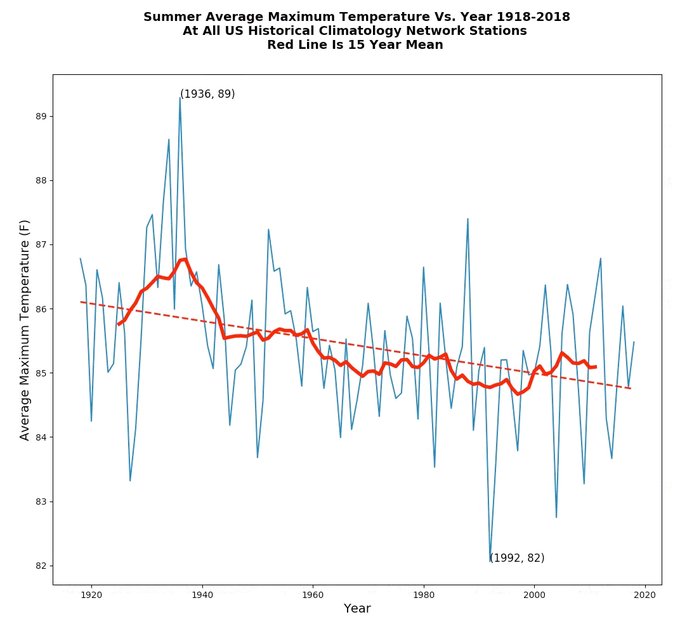
The figure above, showing a cooling trend in the United States, was posted by Steven Goddard (aka Tony Heller) on his blog with the remarkable title of "The Deplorable Climate Science Blog" (actually there is a slightly different one on the blog, right now, but it is simply a difference in the smoothing procedure). The author claims that this graphic is based on real data and that turns out to be true: but is it a honest graph?


The world is becoming more and more complicated. And the more complicated it is, the more difficult to understand it becomes. And there appear more and more opportunities to deceive people: we are all swamped by the news and have neither the competence nor the time to verify what the media serve to us.

So, this August, Mr. Tony Heller, writing under the pen name of Steven Goddard, published on his blog the graph you see above, showing a clear cooling trend in the United States. Make no mistake, these are real data, or so they are said to be. And they do show that summers have been cooling. But what about heat waves we are experiencing nowadays? Just an impression, apparently, because the data say otherwise. Then, what about global warming? An illusion, probably a fraud.

The graph is having a certain diffusion in the social media. An earlier version was even picked up by James Delingpole in his Breitbart news site. It quickly became a growing meme, scoffed or cheered depending on the attitude of the people commenting on it. As usual, the debate on climate on the social media is little more than a shouting match. It took some work by an expert, Tamino, on his "Open Mind" blog to dissect the story of this graph and show the tricks behind it. Tamino's whole post is reproduced below.

Basically, Steven Goddard's post is a textbook example of two well-known propaganda methodsCarlo Kopp describes the technique called "deception by omission" noting that it works when "the victim has poor a priori knowledge or no a priori knowledge or understanding of what the attacker is presenting to be a picture of reality" He also notes that deception by omission is often accompanied by "deception by spin" which consists in presenting only the information favorable to a certain viewpoint of a certain issue.

Note that neither deception by omission nor deception by spin require lying. It is all a way to present (or not to present) the data. This is what Goddard does, carefully choosing the data available on the NOAA site and presenting only those supporting the idea that the US has been cooling, not warming, during the past century or so. That's just not true, but the trick of these things is the ability to demonstrate a wrong thesis by using real data.

And that's what is truly impressive: how little it takes to deceive people. All that was needed to create a wholly new alternate reality was some patience and a high school level ability to manipulate data. No need for Goddard to be a government agent or to be paid by the PTB. All he needs is to be a lone troll with a stone ax to grind.

Now, stop for a moment and think: what if the real spooks were to engage in deceiving us for good? I mean, governments have resources and competencies in propaganda infinitely larger than those of a single person. What could they do to us if they were to direct us to a completely wrong perception of reality? Do you remember the story of the "weapons of mass destruction" at the time of Saddam Hussein? Now they can do much better than that. Yes, they can deceive us. And probably they do - they are doing that right now.

So, what's happening? The anthropologist Roy Rappaport spoke about "diabolical lies," defined as lies which tamper with the very fabric of truth.  Maybe our whole civilization is being destroyed by lies, diabolical or not, and we desperately need a new epistemology to rebuild trust in our institutions and in ourselves as human beings. This is the task that the early Christian thinkers had engaged in at the time when another civilization, the Roman one, was being destroyed from inside by the very truths it had been built on - by then become diabolical lies. As Poul Anderson said, "all evil is rotten good" and that may well describe our situation.

At this point, I can only propose to you to read Tamino's post, below. At least, it clarifies a section of our perception of the universe.

___________________________________________________________________

USA Temperature: can I sucker you?


Suppose I wanted to convince people that temperature in the USA wasn’t going up, it was going down. What would I show? Let’s try yearly average temperature in the conterminous U.S., also known as the “lower 48 states” (I’ll just call it “USA”):


Well that won’t do. It shows that temperature has been rising, not falling. By the way, I’ve included two trend estimates. The blue straight line is a linear trend estimate and it’s going up. The red curvy line is a nonlinear trend estimate, it has gone up and down and up, and is now rising fast. Scary fast. That definitely won’t do.

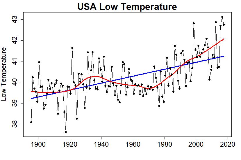
But wait! The temperature shown is the mean temperature, which is the average of the high and low temperatures. What if I tried just low temperatures?


That won’t do either. Scary fast.
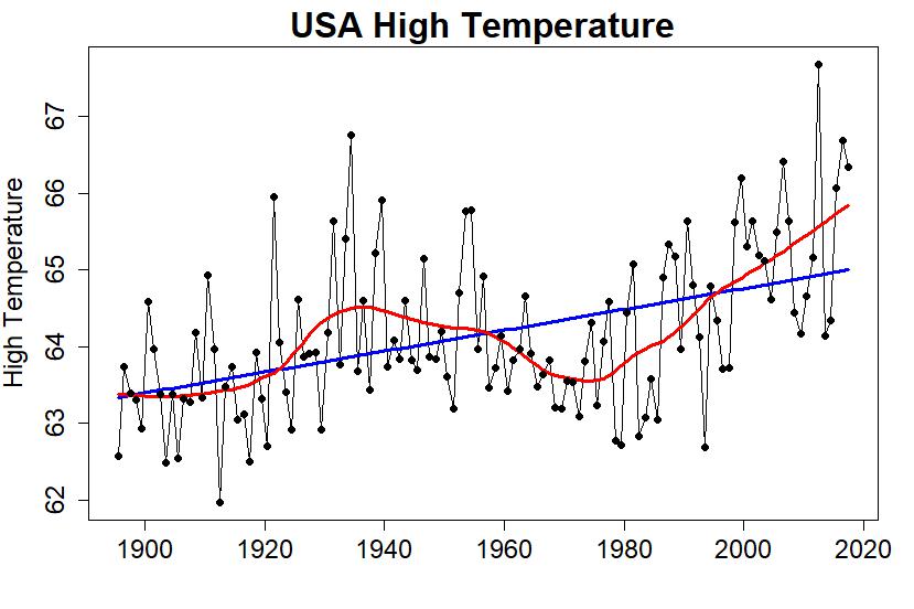
How about high temperatures?


That still won’t do, but it’s a little better. There’s a more pronounced hump in the 1930s — that’s the dustbowl era. Could I maybe make the most of that?

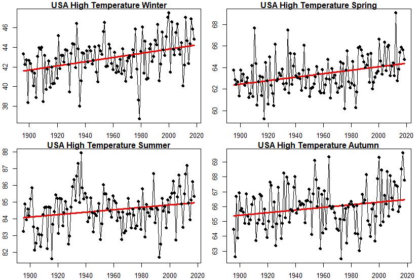
Let’s try this: look at high temperature during the different seasons of the year. After all, we know winter has been warming faster than summer, maybe summertime only — or maybe at least one of the seasons — will give a more useful “sucker people” picture. Here are the average high temperatures for all four seasons separately:


Now we’re getting somewhere! Summer high temperature has still been increasing overall, but that hump during the 1930s (the dust bowl era) is far more pronounced. Maybe I could make something of that?

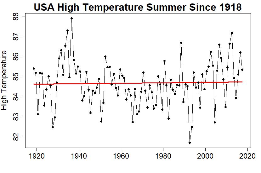
Perhaps I could just get rid of some of the data I don’t like. I can’t get rid of the most recent stuff — then people will figure out I’m trying to sucker them. How about I get rid of some of the early stuff? I’ll start with 1918, instead of starting when the data actually start (1895). That leaves this:


Finally! I’ve got a graph that looks like there’s nothing to worry about, where the linear trend is so small you almost can’t tell it’s still (barely) rising, and I only had to pick one of 12 possible combinations (mean/high/low temperature over winter/spring/summer/autumn) and leave out the early data to get it. Clever.

Even so, the trend is still going up even if just barely. And that’s the linear trend; the nonlinear trend looks like it might be rising noticeably lately, maybe even getting close to as hot as the summer of the dust bowl era. Could I fix that?

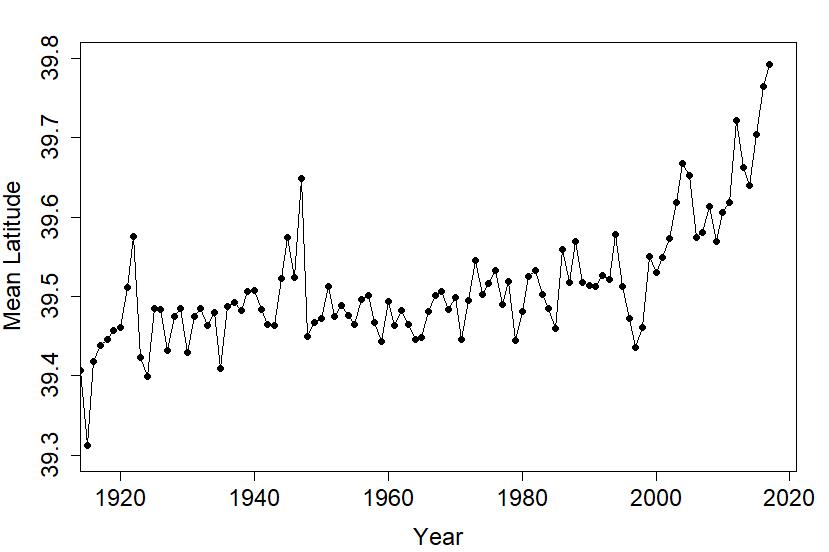
Of course I can! Instead of using the USA temperature data from the “experts,” those people at NOAA (the National Oceanic and Atmospheric Administration) who think they’re so good at it just because they’ve spent decades studying all that “math” and learning how to do it “right,” I’ll just take the raw data and form a simple average. Those NOAA people will tell you that isn’t right, that over the years new stations have come online and old ones have retired so you have to take that into account. They’ll talk about fancy-schmancy math stuff like “area weighting.” That’s all just NOAA tricks, aren’t they just a bunch of frauds? We can completely ignore the fact that over the years the average location of all the contributing stations has moved slightly northward to colder territory:

Heck we can completely ignore everything that they’ve learned about how to do it right … mainly because if we just take a simple, naive average we’ll get what we want.

There’s a graph going around the internet from Steve Goddard a.k.a. Tony Heller, claiming to show that temperature in the U.S. has been declining, using only high temperatures, using only summertime temperatures, using only data since 1918, based on a simple average without taking into account new stations coming online or old stations retiring or area-weighting or any of that “expert” stuff:


Imagine that.


Who

Ugo Bardi is a member of the Club of Rome, faculty member of the University of Florence, and the author of "Extracted" (Chelsea Green 2014), "The Seneca Effect" (Springer 2017), and Before the Collapse (Springer 2019)