Monday, June 13, 2016

Will Renewables Ever Replace Fossils? The Results of a New Survey


The readers of "The Doomstead Diner" are very skeptical about the possibility of a rapid transition to a 100% renewable powered world. 54% of them say that it is impossible. 


A few weeks ago, I posted on "Cassandra's legacy" the result of an informal survey among experts in renewable energy. It asked about the chances of a transition to a world that would be completely powered by renewable energy, and about the chances of being able to attain that before climate change becomes a true catastrophe. Out of some 70 respondents, the large majority was of the opinion that a fast 100% renewable transition is possible and that can be attained without the need of heroic efforts.

I must confess that I found that result surprisingly optimistic, probably because I tend to frequent rather doomerish circles (and note the name of my blog!). Indeed, the people who read doomer sites seem to be even more pessimistic than me. So, "Reverse Engineer" of the "Doomstead Diner" ran the same survey with his readership, finding completely different results. In the Diner's survey, some 250 people participated and 54% of them said flatly that the renewable transition is impossible.

So, what can we say about these surveys? An obvious observation is that reality will decide what's going to happen about the renewable transition without paying too much attention to what puny human beings think. However, there are a few points that may be worth remarking.

1. The optimism of the experts should be considered as something more than just the opinion of the general public. Here, it is clear that the experts have a direct connection with the progress of the field and they perceive the rapid growth in efficiency and the reduction of costs. They are seeing a glimpse of hope.

2. The strong skepticism of the doomers shouldn't be discounted as a fringe opinion. It is an attitude that pervades society and that is not due to ignorance since the respondents to the Diner's survey reported a high level of formal education. However, that didn't shield them from believing in some of the various legends pervading the web. For instance, one respondent said, " All Electric RE require >70 elements of the periodic table. And they are NOT RENEWABLE."

3. The greatest shortcoming of renewables according to the doomers is their intermittency. That is a little strange, and it indicates how most of us tend to think in the BAU frame only. People are accustomed to have electricity "on demand" and won't consider the possibility of a world in which the supply is "demand managed."

4. The majority of the doomers indicated that the best renewable source is human slave labor. That's not surprising; after all, they are doomers!

5. It is refreshing, however, that only 2% of the doomers indicated that they believe that homo sapiens will soon go extinct.


There are a lot of details that you may find interesting in the survey published on the Doomstead Diner. But I would like to conclude this post with a personal note. It is something that I was telling to RE (Reverse Engineer) yesterday. I find that I am becoming less doomerish than I used to be. I can't really say why, but I think I see a chance.  Just a chance, and that won't save us from crashing against the limits of the ecosystem. But, with a little luck, we will emerge into a new world, better than the present one.


Saturday, June 11, 2016

Photovoltaic is an Energy Source, not a Sink!

This is a comment by Luis De Souza on a recent paper by Ferroni and Hopkirk who reported a negative energy yield for photovoltaic plants in Switzerland (in other words, an energy return, EROEI, smaller than one). It is an anomalous result, considering that a comprehensive meta-analysis of the field reported values of 11-12 for the EROEI of the most common PV technology. So, what's wrong with the paper by Ferroni and Hopkirk? A lot of things, it seems. Here, De Souza shows that photovoltaics is a source of energy, even in a not so sunny country as Switzerland. He concludes that something went badly wrong with the review procedure with the journal that published the paper by F&H, "Energy Policy". That seems to be correct and you may be interested to know that an extensive rebuttal of that paper has been prepared and submitted to the journal by a group of researchers expert in the field of energy calculations. That rebuttal finds a lot more wrong things in F&H's paper than those identified by De Souza. In short, Energy Policy managed to publish a flawed study that should never have been published in a scientific journal. Unfortunately, it was done and now a lot of people are using it to support the war against renewable energy.


Photo-Voltaics is not an energy sink in Switzerland

by Luis De Souza

Energy Policy recently published a study conducted on the EROEI of Photo-Voltaics (PV) technologies installed in Switzerland. The end result is a remarkably low figure of 0.8:1, well below any EROEI assessments ever conducted on this energy technology.

Such a figure naturally made the delight of those campaigning against renewable energy, who take at face value any hints of negative performance. However, from this study a number immediately stands out: average lifetime energy yield of 106 kWh/m2/a. As it turns out, a closer look at this single figure is enough to disprove the hypothesis of PV being an energy sink in Switzerland.

Basic check

The first check one can conduct on this EROEI study is to compare it with previous assessments. Pedro Prieto and Charles Hall produced what is possibly the most conservative EROEI study on PV, concluding on a figure of 2.4:1 for Spain. There is much to question in this study, in particularly the arbitrary translation of non physical requirements of a PV system into energy inputs, but for the purpose of comparison let this low figure be taken at face value.

Yearly solar radiation at the latitude of Madrid (40 ºN) is in the range of 2 000 kWh/m2. At the latitude of Bern (47 ºN) this value is down to 1 500 kWh/m2. Assuming the extraordinarily high energy inputs computed by Prieto and Hall for Spain also apply to Switzerland one can directly apply the rule of three to compute an EROEI figure of 1.8:1.

Mind here that EROEI is a logarithmic measurement. Therefore 1.8:1 is considerably closer to 2.4:1 than to 0.8:1. These simple figures start showing that something is fundamentally awkward with the results presented by Ferroni & Hopkirk.


Why energy per unit of area?

The article in itself is not very detailed and leaves much for the reader to guess. However, there is a key figure that plays into this EROEI study that immediately stands out: an average lifetime energy output of 106 kWh/m2/a for solar panels installed in Switzerland. Upfront, it appears a strangely low figure, but there is something more problematic with it. Each solar panel model is designed and built differently, with cells distributed in different ways; even among those produced by the same manufacturer the capacities per unit of area can be quite different.

The graph below shows capacities per unit of area for different models presently on sale by various manufacturers, including the world's top three.

While Ferroni & Hopkirk never indicate what energy output per installed capacity they use, this sample of panel capacity per unit area allows for some investigation into it. The figure below presents this calculation for these same panel models. 


Again, the figures vary widely, with the average under 700 Wh/Wp/a.


Comparison with PVGIS

PVGIS is a web application developed by the Joint Research Centre (JRC) that calculates the energy output of a PV system taking into account yearly solar insulation, panel orientation and system losses to cabling, the inverter, temperature, angular reflectance and more. PVGIS has not been updated in a few years and for the most recent systems I have been involved with it underestimates first year output by 5% to 10%. But for this exercise its results are taken at face value.

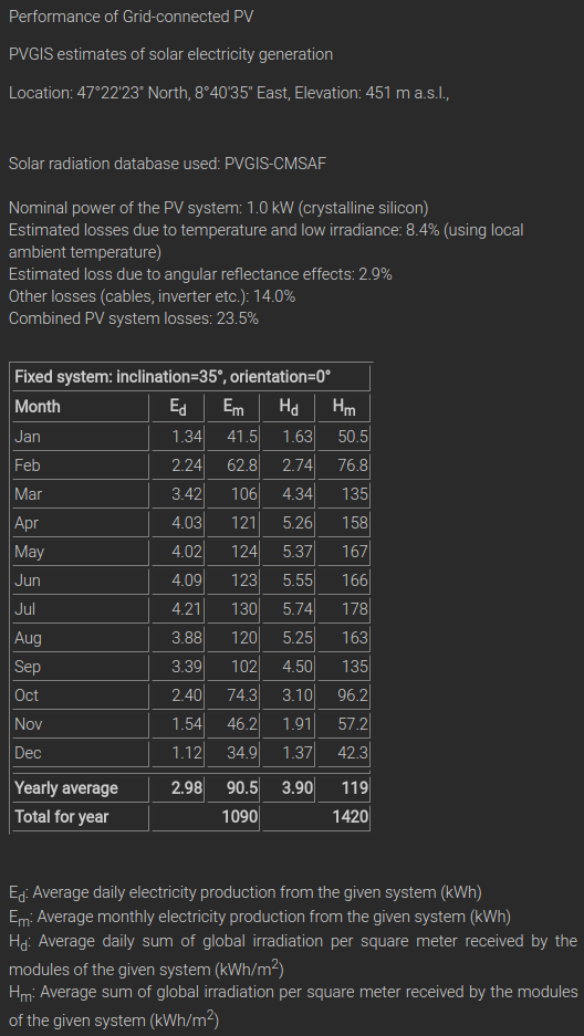
The table below is the result produced by PVGIS for an hypothetical system rated at 1 kWp, optimally oriented and installed around where I live, in the Canton of Zürich (47 ºN, in the Northwest of Switzerland). The most relevant figure in this report is the energy output estimate: 1090 Wh/Wp/a. While this is an estimate for an optimally oriented system, it provides a good measure of where the annual energy yield figure used by Ferroni & Hopkirk actually lays. 


PVGIS © European Communities, 2001-2012
Reproduction is authorised, provided the source is acknowledged
See the disclaimer here


Comparison with Swiss statistics
Ferroni & Hopkirk cite the statistics compiled by Swiss Federal Office of Energy (SFOE) as the source of their 106 kWh/m2/a figure. There are a number of different documents available from theSFOE website covering all matters of energy generation and consumption.

In recent years the SFOE has produced a yearly report of renewable energy with a series of important figures. The report for 2015 is not available yet, therefore the figures used here refer only up to 2014. These are all aggregate values, but are already enough to provide another investigation path into Ferroni & Hopkirk's figure.

After going through these reports, one thing becomes evident: the SFOE does not use the energy output per unit area measure cited by Ferroni & Hopkirk. As expected, average electricity generation figures are rather provided in energy output per installed capacity (Wh/Wp/a).

Secondly it is important to note that PV is something relatively new in Switzerland, installed capacity has picked up only recently, almost tripling from 2012 to 2014. At the end of 2014 there were 1060 MWp of PV panels installed in Switzerland, a figure that grew 40% that year alone. During 2014 electricity generation from PV reached 841 GWh.

Assuming that all the new systems installed in 2014 were connected to the grid on the 1st of January a figure 794 Wh/Wp comes out for the year. This is already on the high side of the possible generation per installed capacity figures used by Ferroni & Hopkirk. However, assuming that these new systems where connected to the grid at a regular pace throughout the year, this number rises to 927 Wh/Wp. This is less than 15% off the PVGIS estimate, and possibly explainable by non optimal orientation of some systems and a small fraction of older and likely less efficient systems. Usually, systems tend to be installed towards the end of the year, to take up the most favourable legislative framework.

Possible causes

The first cause that comes to mind for such low energy yield figure is an erroneous cell efficiency factor. PV cells are rated in control experiments where their energy output is assessed at a temperature of 25 ºC and a constant radiation of 1 kW/m2. This assessment is very useful to compare different cell technologies. Modern day wholesale crystalline cells reach efficiency factors between 14% and 16%, i.e. they convert that fraction of incident radiation into electrical current.

Since Ferroni & Hopkirk present average lifetime yield in energy per unit area, these authors might have converted incident radiation in Switzerland directly into an energy yield. However, instead of using the figures above, the efficiency factor they used must have been in the order of 8% to 9% to result in an energy per installed capacity value around 690 Wh/Wp/a. Such low conversion factors are more common with thin film technologies.

A second hypothesis is the employment of an unusually high cell degradation rate. PV cells loose their properties over time, both to the heat they are exposed to, as to the solar radiation itself. While tools such as PVGIS can easily model system losses, they usually leave this degradation rate out. Research centres such as the JRC have assessed PV technologies for decades, concluding on an energy yield degradation rate in the order of 0.5 %/a. Moreover, these long term studies also indicate that cells tend to degrade in a linear fashion.

The following figure presents two hypothetical degradation rates that bring down a PV panel from 1090 Wh/Wp/a to an average yield of 690 Wh/Wp/a over a 25 year lifetime: a liner degradation of 33.5 Wh/Wp/a and a logarithm decline of 4 %/a. In both cases the energy yield dives under half before the end of system life.


While this latter hypothesis is my favourite, it does not explain the employment of the strange energy per unit area figure. Also, these degradation rates would assume that in the face of a fast collapse in energy output owners would never activate panel warranty. 


Final remarks

Replacing the inexplicably low energy yield figures used in this study by those available from the SFOE is already enough to bring the Swiss PV park into positive net energy territory. However, such result is still far from previous PV EROEI assessments, even the highly conservative estimate produced by Prieto & Hall. Just as the energy yield assumptions proved problematic in this study, I expect similar awkwardness to be found on the energy input side of the equation. However, I leave this aspect to be assessed by someone else.

The publication of such a study by a relatively renowned outlet begs for deep reflection. The last article I authored in a scientific journal was over two years in review; this is usually a slow and painstaking process. Being myself an editor and reviewer at scientific publications, I am at a loss to explain how could such a problematic figure of 106 kWh/m2/a have possibly made through the peer review process. It should have immediately raised a red flag to whoever is slightly acquainted with PV technology and economics, calling for close scrutiny by reviewers and editors alike. Something fundamental has failed in the review process at Energy Policy. 


The Take Away

The EROEI figure concluded by Ferroni & Kopkirk for PV is the lowest ever and far below any previous studies.

These authors use awkward units that largely obfuscate their assumptions on yearly energy yield.

A sample of various panel models points to an energy yield under 700 Wh/Wp/a used in this study.

Official statistics point to an average yield well above 900 Wh/Wp/a for the Swiss PV park; this is in line with values from assessment tools like PVGIS.

The peer review process is not functioning properly at Energy Policy.


Thursday, June 9, 2016

Never Cry Wolf! The Worst Climate Prediction Ever Made

If you cry wolf, and the wolf doesn't come, you'll make a fool of yourself. But it will be much worse if you don't cry wolf, and the wolf comes.


Professor Nicola Scafetta, showing his 2010 predictions for global temperatures (from Meteo Live News). These predictions turned out to be spectacularly wrong. 


The debate on anything that has to do with the future often becomes a peculiar version of the story of "Crying Wolf". Assume that somebody cries wolf and that the wolf doesn't come. Then, someone else will often conclude that wolves don't exist (or are something nobody should be worried about). Something similar occurs in areas such as climate science when past uncertainties are taken as indicating that climate change does not exist (or is something nobody should be worried about.)

Truly, it is a perversion of logic, but it has its reasons. Suppose that the appearance of wolves is relatively rare; then, even though you may know nearly nothing about wolves, it is a safe bet that you will be much more popular with shepherds if you tell them that the wolf won't come. And, normally, you will be able to claim that you were right; except when the wolf comes, of course, But, in that case it is likely that shepherds will be much more worried about saving their sheep than about chastising you for your incompetence in wolf matters.

Something similar seems to be happening with climate change where plenty of people, usually knowing very little about climate science, tend to reassure people that climate change doesn't exist or that it is nothing to be worried about. Inasmuch as waterfront houses are not normally washed away every week by hurricanes and sea level rising, these reassuring predictors can claim to have been right,

But sometimes even doomslayers may have a bad time when they try to make quantitative predictions. One remarkable case is that of Nicola Scafetta, who attempted to use a sophisticated statistical treatment (aka: let's torture the data until they confess) to prove that global warming is mainly caused by long-term planetary cycles. On the basis of his models, in 2010, he predicted that global temperatures should have remained constant or should have been going down; while in 2012 he predicted that temperatures should have been growing at a much slower rate than predicted by the standard climate models. On the basis of these predictions he gained a certain notoriety in some circles.

Well, if there existed a prize for the worst climate predictions, I think these ones by Scafetta could legitimately concur for it. Global temperatures refused to follow his prediction and are actually exceeding the result of the IPCC models that Scafetta had criticized.

Judge by yourself; below, you can see the results presented by Scafetta in 2010 (N. Scafetta. I cicli climatici e le loro implicazioni. Periodico semestrale dell’Associazione Normalisti. n.2 dicembre 2010) (see also this link). Recent temperature data added in red.


Some more recent predictions by Scafetta are a little better, but still widely off the mark (recent  temperature data added in red)


So, here is the conclusion: since we have solid physical evidence that wolves exist (unlike dragons and unicorns), you'd better pay attention to those who tell you that your sheep could be in danger. In the same way, since we have solid physical evidence that greenhouse gases cause warming and that their concentration is increasing, you'd better pay attention to those who tell you that your waterfront property is in danger (and not just that!)

Acknowlegement: Stefano Caserini prepared the figures shown in this article.


Note: this article was prompted by a debate that I had today with Nicola Scafetta at the AIGE-IIETA 2016 conference, in Naples. In his talk, Scafetta spent most of his time criticizing the standard general circulation models, saying that they don't reproduce well the historical data and that they are affected by huge uncertainties. He said that these models much exaggerate the climate sensitivity to CO2, although he stated that he does not deny that greenhouse gases have an effect on global temperatures. Then, he showed the results of his models compared with historical data, but always stopping the comparison with 2012 or 2013. He also said that according to some new work he has performed, he believes that Jupiter has a strong effect on the earth's temperatures. 

In my comment, I showed to the public the data that I am publishing in this post and I asked Scafetta how he can justify such glaring errors. Scafetta said that these are old results and that now he has better models. I countered saying that he can't change his assumptions every year and every year pretend to make reliable predictions. He reiterated that his model works now. Then, the moderator said that we had to stop and he recommended to everyone caution in believing models. And that was it!


Tuesday, June 7, 2016

The Seneca Cliff of Oil Production


The concept of the "Seneca Cliff" seems to have gone mainstream. Below, it is mentioned in a recent post by Dennis Coyne on "peakoilbarrell" as an obvious concept. Just as when you say "Gaussian Curve", you don't have to specify what shape the curve has, so it is for the "Seneca Curve". It looks like I started some kind of avalanche with my 2011 post when I introduced the term. See also my blog wholly dedicated to the subject.

Here, the projections by AEO (annual energy outlook) seem to me very optimistic; can production really keep growing until 2035-2040? If that were to happen, however, the subsequent collapse would be truly abrupt.

___________________________________________


EIA’s Annual Energy Outlook and the Seneca Cliff


blogchart/
The scenario above shows an Oil Shock Model with a URR of 3600 Gb and EIA data from 1970 to 2015 and the Annual Energy Outlook (AEO) 2016 early release reference projection from 2016 to 2040. The oil shock model was originally developed by Webhubbletelescope and presented at his blog Mobjectivist and in a free book The Oil Conundrum.
The World extraction rate from producing reserves must rise to 15% in 2040 to accomplish this for this “high” URR scenario. This high scenario is 100 Gb lower than my earlier high scenario because I reduced my estimate of extra heavy oil URR (API gravity<10) to 500 Gb. The annual decline rate rises to 5% from 2043 to 2047 creating a “Seneca cliff”, the decline rate is reduced to 2% by 2060.
blogchart/
The scenario presented above uses BP’s Energy Outlook 2035, published in Feb 2016. This outlook does not extend to 2040, maximum output is 88 Mb/d in 2035 at the end of the scenario. This scenario is still optimistic, but is more reasonable than the EIA AEO 2016. Extraction rates rise to 10.6% and the annual decline rate rises to 2.5% in 2042 and is reduced to under 2% by 2053.

Saturday, June 4, 2016

Demand destruction and peak oil


Roger Baker is a transportation and energy reform advocate based in Austin, Texas. Long time member of ASPO, we actually met at one of the first ASPO conferences, the one held in Pisa, in 2006. Here he discusses the current situation with crude oil and the global economy. 


by Roger Baker


We are fully under the influence of petroleum demand destruction. The global oil market can't function without real oil production price discovery, which doesn't exist in the currently deflationary global economy, which forces indebted producers to sell far below cost.

Both supply and demand seem to cyclic in nature and we are not finished with the supply destruction phase, which can only be revived through a globally realistic oil trading price, which nobody knows. This is an unknown until demand destruction also runs its course. The global demand in the oil supply-demand balance that sets the global oil price cannot be known until we can understand where the global economy is headed. The global material economy seems to be contracting as the Baltic dry index, trucking, and railroad profitability seem to affirm, even ignoring oil prices and Chinese economy.

The reality is probably that a falling EROEI and the end to cheap oil after ~2005 made our finance capital investment growth less profitable. But this fundamental shift has been hidden through easy central bank credit and fiat currency generated on demand to pay interest on a growing mountain of unpayable debt, with a shift of debt from private hands to public, such as away from Wall Street toward Fed and US Treasury obligations. Now we see the world's major central banks each independently creating their own fiat currencies to preserve a trading advantage, led by the dollar as the world's standard reserve currency. (if it were up to me, things would work out a lot better if each dollar would be exchangeable on demand for a quart of conventional oil)

Under current conditions, nobody can predict a meaningful exchange rate for the major currencies trading on the key foreign exchange market; the trade exchange rates and pegs are established through national politics and are thus arbitrary, which leads to Triffin's paradox. National sovereign bank policies tend toward easy money, more debt, and business as usual. Global trade generates its own pressures that necessarily, for the sake of stability of global trade, have to be soundly based on how much energy, labor, and investment capital really went into the production of the goods being exchanged. Here the trends don't look so good.

<http://www.oftwominds.com/blogapr16/triffins-paradox4-16.html>

It looks like a system that tends to resist change and internal pressure for reform until things break down into a sort of a global version of a "Minsky moment" where financial guarantees behind finance break down like a domino effect, think late 2008 before the emergency bailouts. Trying to predict how far an out-of-balance system can be pushed before it breaks down or stalls out is impossible.

When this happens, there is no reason to expect an orderly contraction toward the lower energy supply and demand balance needed to encourage new oil investment. It may look more like a chaotic price increase in a world full of angry oil junkies fighting over the existing production. Or maybe it already is that way more than we would like to admit.

Back to oil economics. Following is a nice analysis of when we might expect the next oil price spike, considering the current trends. Perhaps in early 2018 as this estimates? I have seen others guess maybe 2017 for a slow return to a tight global oil market. At any rate, this analysis gives appropriate credit to the many things that can go wrong in the meantime. This has a useful geopolitical account of the various global oil production regions, including Art Berman's rather discouraging Permian shale oil profitability map.

<http://attheedgeoftime.blogspot.co.uk/2016/05/this-is-peak-oil.html>

Jeffrey Brown makes the very important point that special attention should be focused on the higher boiling fractions of petroleum known as distillate. You can crack big hydrocarbon (distillate) molecules into little ones during refining, but you can't (affordably) go back the other way to make the little ones into big ones.

The problem here is that what we might call the raw mobile muscle power for our civilization and its trade rests critically on the availability of these bigger distillate molecules that mostly come from conventional oil. Trucks, planes, airplanes, ships and heavy equipment mining won't work using the smaller hydrocarbon molecules that predominate in gasoline. These lighter fractions tend to be favored in tight oil due to the geology and physics involved.

For this reason, whenever we do see oil production price discovery again due to the return of a tight global oil market, if operating under orderly market conditions, we should expect to see it expressed as a global fuel price shift. One where distillate price rises stubbornly, relative to the price of lighter fuel fractions like gasoline.


Friday, June 3, 2016

On being a Cassandra: more than 500 posts and continuing!


The Cassandra blog was started in January 2011 and has been growing, even though growth seems to have been slowing down during the past year or so. I am not sure how much the statistics provided by Blogspot are to be trusted, but they say that Cassandra has now around 60,000 hits per month for a total of nearly two million visits and 521 posts published. Not so bad for a blog kept by one person, without SEO tricks or anything like that.

About the posts published so far, the biggest impact was the post on the "Seneca Effect" that even generated a new blog specifically dedicated to the concept expressed by the old Roman philosopher that "increases are of sluggish growth, but ruin is rapid." It is also generating a whole book that I am trying to write. Hopefully, it will be published in early 2017.

Does this blog have an impact on the real world? Hard to say; probably not. The themes treated here remain something discussed only among a relatively small group of people whom the rest of the world ignores. But, after all, for a blog that bears the name of "Cassandra," that's something to be expected!

And if you would like to know something more about the ancient prophetess Cassandra, I am proud to present to you an interview with her, summoned from Hades!


Image from Cassandra Consulting

Who

Ugo Bardi is a member of the Club of Rome, faculty member of the University of Florence, and the author of "Extracted" (Chelsea Green 2014), "The Seneca Effect" (Springer 2017), and Before the Collapse (Springer 2019)